Four Tricks to Make AI-Generated UIs Actually Look Good
Four Tricks to Make AI-Generated UIs Actually Look Good
I've been playing with Claude lately, and it's genuinely impressive at UI design. Previously, when you asked AI to build interfaces, you'd get emoji-riddled pages with empty image placeholders. In a word: ugly.
But after figuring out a few tricks, I can now whip up a professional-looking interface in 20 minutes. These techniques are simple but incredibly effective.
Case Studies
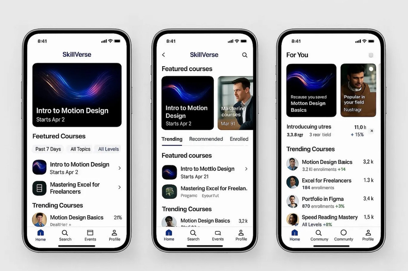
Here are some recent projects:
- Card drag interaction: Smooth animations with natural card reveals
- Search box animation: Gradient breathing effect on focus
- Parallax webpage: Morphing effects and shadow transitions on hover
In the past, designers would spend hours in After Effects for these effects, and developers would struggle with the code. Now? Less than 20 minutes each.
Why Your AI UIs Look Bad
People often ask: "Why do my Claude-generated interfaces look terrible?"
The issue isn't the AI—it's how you communicate with it. As a former big-tech product designer, I understand design principles. Today, I'll share four practical tricks to transform your AI interfaces.
Trick 1: Show, Don't Tell
Stop describing your design ideas with words.
Find a design you like on Dribbble or Layers, and give it to Claude. One image beats a thousand descriptions.
Focus on what static images can't show:
- Animation behaviors
- Interaction details
- Special element treatments
Let AI handle the visual style by copying the reference.
Trick 2: No Empty Image Slots
Claude often leaves blank spaces where images should be. It looks unfinished.
Solution: Use Unsplash images.
Unsplash is an open-source image library with direct API access. Adding images instantly elevates your interface.
https://source.unsplash.com/800x600/?nature
These URLs work directly and auto-match images by keyword.
Trick 3: Professional Icons, Not Emoji
Emoji works for casual contexts, but serious interfaces need better.
Use professional icon libraries:
- Font Awesome
- Material Icons
Both have CDN support—no installation needed. Consistent icons = polished interface.
Trick 4: Use TailwindCSS
Raw CSS is tedious, and AI tends to improvise too much.
Enforce TailwindCSS.
Tailwind provides a mature design system with opinionated choices for colors, spacing, and responsive design. It's like giving AI "aesthetic training wheels."
CDN inclusion:
<script src="https://cdn.tailwindcss.com"></script>
Complete Prompt Template
Combine these tricks into one prompt:
Create a [page/component type] with beautiful HTML+CSS code.

## Design Reference
Style reference: [upload image or describe]

## Tech Stack
- HTML + TailwindCSS + JavaScript
- Tailwind 3.0+ (CDN)
- Responsive design

## Resources
- Images: Unsplash API
- Icons: Font Awesome or Material Icons (CDN)
- No emoji as icons

## Interactions
- Button hover: slight scale
- Input focus: gradient border
- Card hover: deeper shadow

## Output Requirements
- Clean comments
- Complete runnable HTML
- Optimized visual hierarchy
Advanced: Generate Figma Designs
To convert AI interfaces into design files:
- Deploy online: Use Claude/POE built-in publishing or yourware.so
- Convert to design: Use Figma plugin
html.to.design
This plugin auto-generates components with auto-layout. 10 free conversions daily.
Summary
The core principle: Don't let AI guess your taste.
- Show references, don't describe vaguely
- Use real images, not placeholders
- Use professional icons, not emoji
- Use design systems, not raw CSS
Try these methods, and you'll find AI suddenly "gets it."
Related Posts
 AI Tools
 deltaqin
 AI Tools
 AI Tools